Field note
Status Colors That Do Not Rely on Color Alone
Green for a win, red for a loss, amber for pending: casino and sportsbook screens lean on color more than most products. For players with low vision or color vision differences, a color with no word or shape beside it carries no information at all.
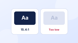
The two rules that apply
WCAG 2.2 criterion 1.4.1, Use of Color, at level A, says that "Color is not used as the only visual means of conveying information, indicating an action," prompting a response or distinguishing a visual element. Criterion 1.4.11, Non-text Contrast, at level AA, asks for a contrast ratio of at least 3:1 against adjacent colors for interface components and meaningful graphics. Text inside a badge falls under criterion 1.4.3: at least 4.5:1, or 3:1 for large-scale text. See non-text contrast in the glossary.
Where casino screens rely on color
| Signal | Color-only version | Add this |
|---|---|---|
| Odds moving | Odds flash green or red | An up or down arrow and a text change announced for screen readers where it matters |
| Bet result | Green or red row in bet history | The words Won, Lost or Void |
| Withdrawal status | Colored dot | The status word and a date |
| Limit reached | Amount turns red | A message saying the limit is reached and when it resets |
| Form error | Red border | A written message and an icon |
| Selected payment method | Tile tinted blue | A check mark and a selected state in code |
Checking contrast correctly
Contrast ratio compares the relative luminance of two colors, and the W3C says computed values "should not be rounded", so 4.499:1 fails a 4.5:1 test. The contrast checker explains the formula and applies it; see also contrast ratio in the glossary.
Two casino-specific traps: text over game artwork, where contrast changes across the image, and "disabled-looking" gray text used for live terms and conditions. Put text over a solid scrim, and keep terms at full contrast.
A badge pattern that works
- A word first: Pending, Approved, Paid, Declined.
- An icon that differs in shape, not only color: clock, check, arrow, cross.
- Badge text at 4.5:1 or more against the badge background.
- A badge edge or fill at 3:1 or more against the page, if the badge shape itself carries meaning.
- The same words in the accessible name, so screen readers hear the status.
Worked example (invented)
Bet history row: "Lost" in dark red text (#9E1B32) on a pale pink badge (#FDE9EE), with a small cross icon, next to the stake and date. The badge text passes 4.5:1 with room to spare, and a player who cannot tell red from green still reads "Lost".
Questions
Is red and green ever acceptable for wins and losses?
Yes, as long as color is not the only cue. Add a word, a symbol or a position change, and check the contrast of any text.
Do logos have to meet contrast ratios?
No. WCAG's contrast criterion exempts text that is part of a logo or brand name. Brand colors used for buttons, links or status text still have to pass.
Sources
- W3C, Web Content Accessibility Guidelines (WCAG) 2.2, W3C Recommendation, December 12, 2024.
- W3C WAI, Understanding Success Criterion 1.4.3: Contrast (Minimum), updated September 6, 2026.
- W3C, MathML version of the relative luminance definition, no date shown.
Every source was read on October 27, 2026. How we choose and date sources: data sources.